Trinkdose Product Packs
Social media systems, global communication, brand consistency at scale.
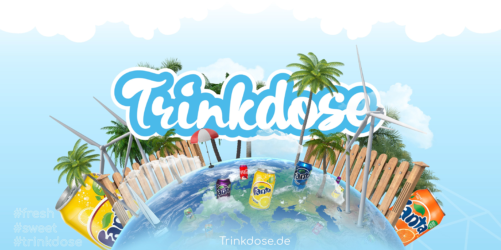
A playful brand, consistent everywhere.
Trinkdose is a German drinks brand (trinkdose.de) that sums itself up in its own hashtags: fresh and sweet. The work covered campaign and social media visuals plus the product pack artwork, with one goal: a bright look people recognise at a glance, whether they meet it in a feed, on a banner or next to the product.
The challenge with a brand like this is volume. New products and new posts arrive all the time, and each one is a chance to drift away from the brand. So the job was less about one beautiful image and more about a system that keeps everything looking like Trinkdose.
How I approached it.
- Set the visual world first: a sky-blue palette, soft clouds and a rounded script logo that feels friendly and summery
- Built the key visual around a globe covered in drink cans, palm trees and beach details, so the idea of drinks from around the world lands without a line of copy
- Turned that world into repeatable social formats, so every post shares the same colours, type and hashtag placement
- Applied the same rules to the product packs, so product images and campaign artwork read as one family
One look across products, markets and channels.
Trinkdose ended up with a recognisable visual language and a set of social and product pack assets that stay consistent across products, markets and channels. The key visual is the anchor: everything else borrows its colours, its mood and its sense of fun.