Brand · Web · Strategy
Ana Oliveira Fashion
Identity, web design, visual systems, and client creative direction.
The brief
A fashion identity with presence.
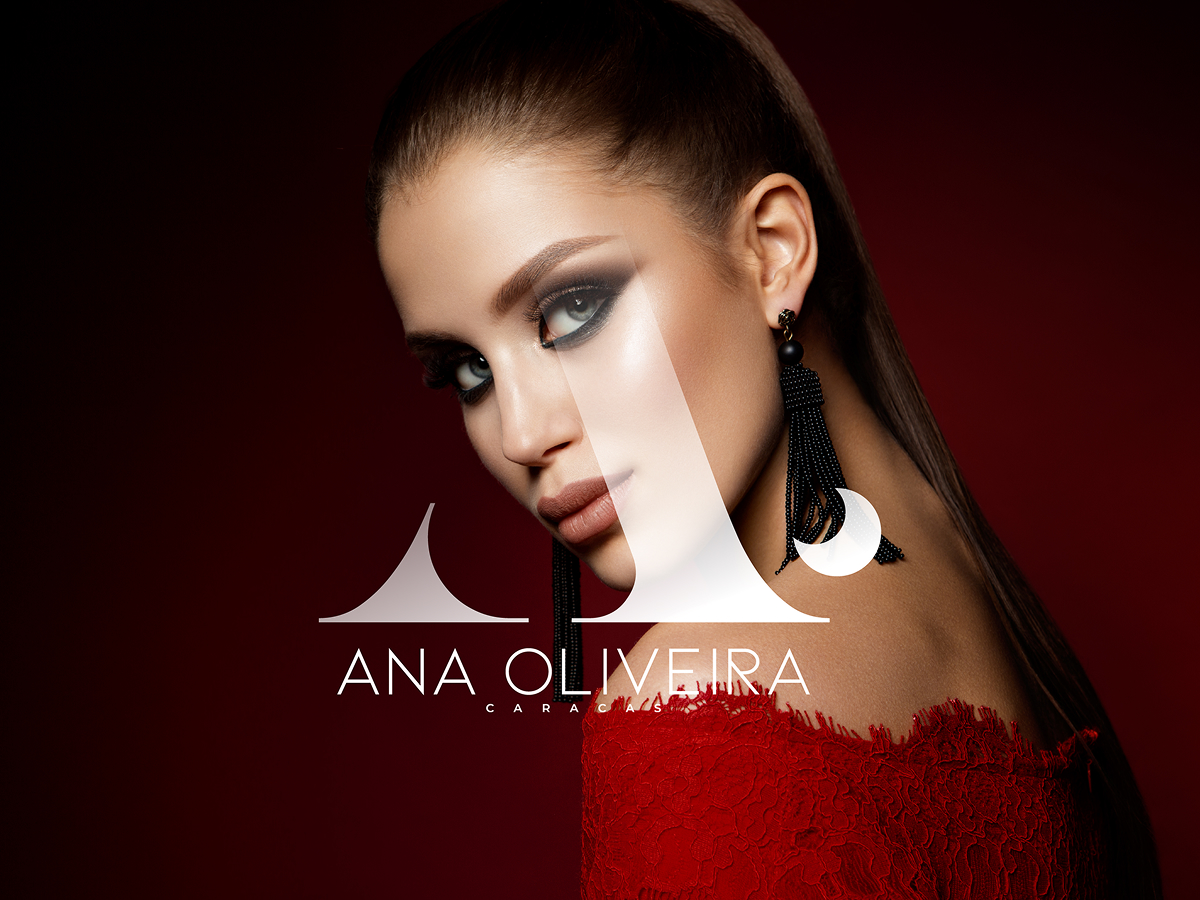
Ana Oliveira is a fashion brand that carries its city in the logo: Caracas sits right under the name. The project covered the identity, the website and the visual system, with creative direction for the client throughout.
Fashion identities live next to photography. The mark had to hold its own over a strong portrait without fighting it, and stay elegant when it appears alone on a tag, a web header or a social profile.
Approach
How I approached it.
- Drew an AO monogram from high-contrast serif shapes, large enough to act as a graphic element and not only a signature
- Paired it with a light, widely spaced sans-serif wordmark, so the name stays quiet and refined
- Chose a deep red and black palette that works with editorial photography and gives the brand a dramatic, evening feel
- Carried the same rules into the website and the visual system, so type, colour and imagery behave the same on every page
Result
Elegant and unmistakably hers.
The client received an identity, a website design and a visual system that work together, plus direction on how to use them. The monogram over photography became the signature of the brand: recognisable at a glance and flexible enough for every touchpoint.