Financiera Confianza
Rebuilding the mobile banking app for 715K+ microfinance clients across Peru, from a confusing chatbot into a clear, trusted everyday tool.
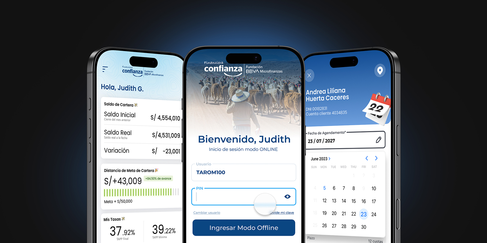
Banking for people traditional banking forgot.
Financiera Confianza is the Peruvian microfinance institution of the BBVA Microfinance Foundation. It serves more than 715,000 clients, mostly micro-entrepreneurs, farmers and families in urban and rural communities, through 200+ service points in nearly every region of Peru.
For many of them, our app is their first digital bank. I joined in June 2023 as a UX Designer and became UX/UI Chapter Leader in January 2024, leading UX/UI for the redesign and migration of the Financiera Confianza App. The goal was simple to say and hard to do: get people to actually use it.
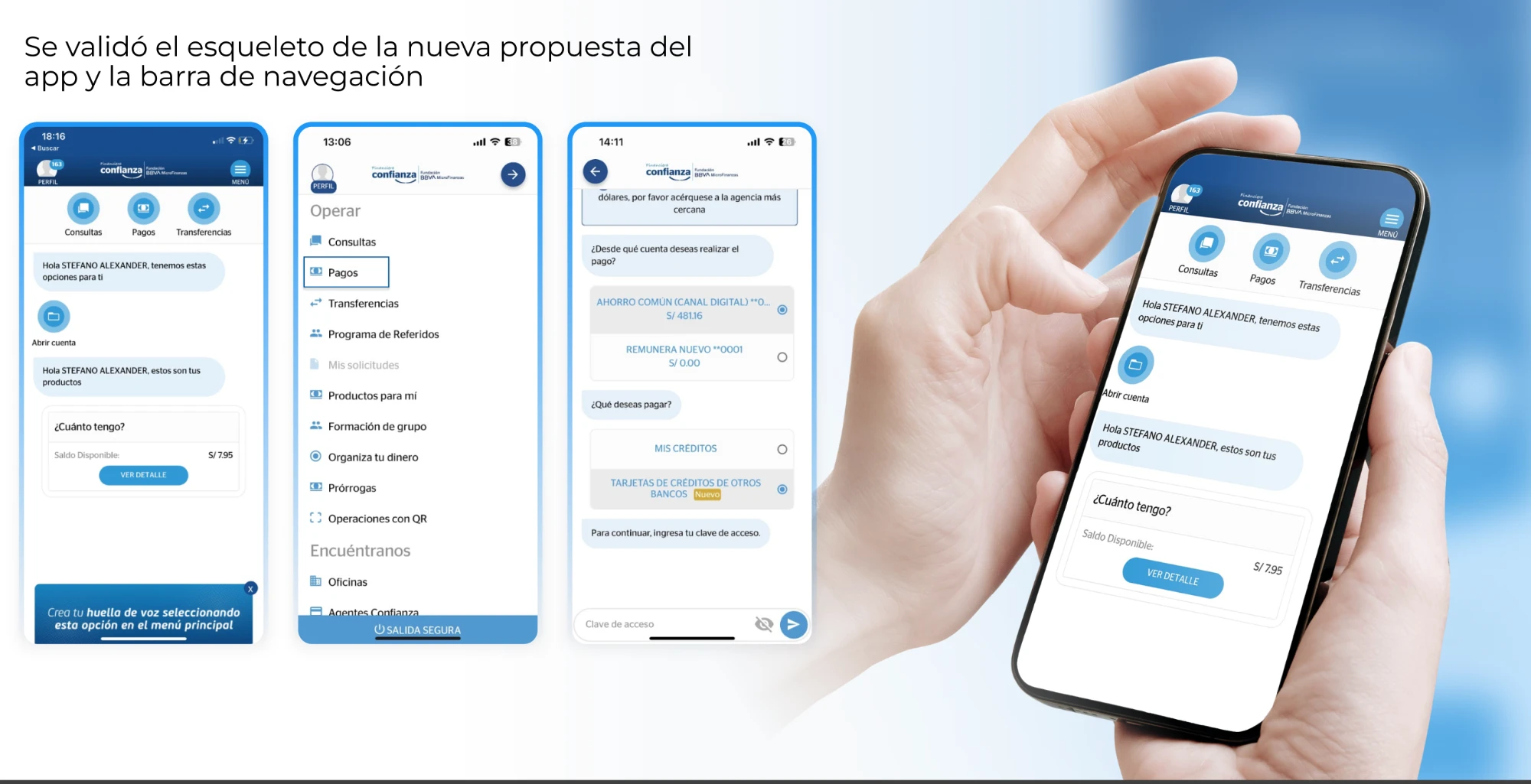
An app that talked a lot and said very little.
The original app worked like a chatbot. Every operation was a conversation: the app asked a question, the user answered, and it asked another one. There was no home screen with clear actions, no obvious place to start, and no way to see the shape of a task before you were inside it.
The result was a product that was hard to follow, easy to get lost in and full of errors. Clients didn't come back. Even our own advisors and branch administrators avoided it, so they couldn't recommend it with confidence. When I joined, the usability rate was around 6.3%. Early fixes took it to 8.28%, but the structure itself was the problem.
How might we build an app that truly covers our clients’ needs?
- Understand our clients and their needs in a digital environment
- Discover how clients actually experience the current Financiera Confianza app
- Measure the gap against competitors and find room to innovate
We crossed rivers to hear from our users.
Research happened in the field, not in a meeting room. We split into teams and travelled across Peru, to Cusco, Huancayo, San Martín and Metropolitan Lima, from cities to rural communities only reachable by river, to interview clients face to face in their homes, shops and fields.
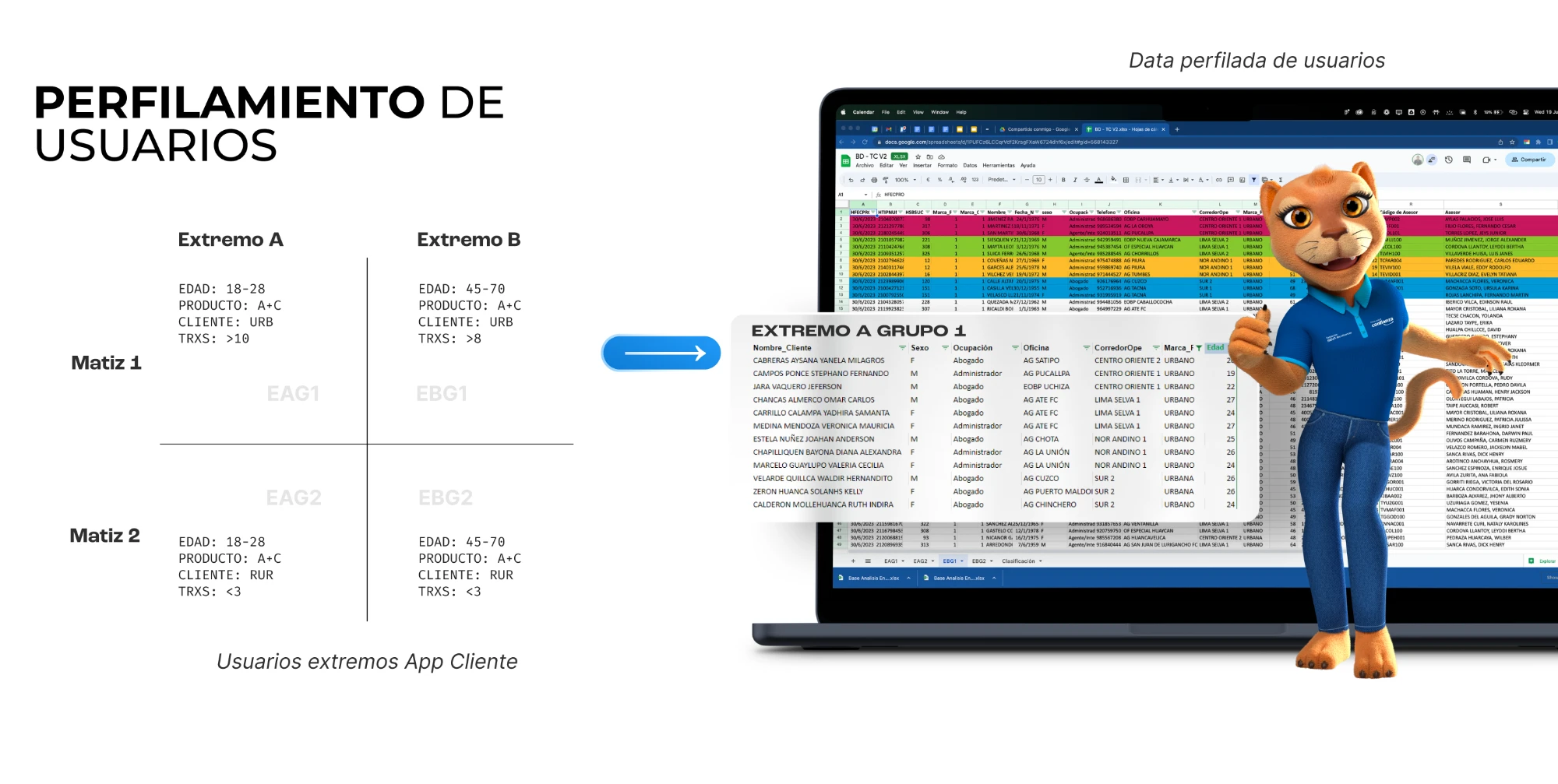
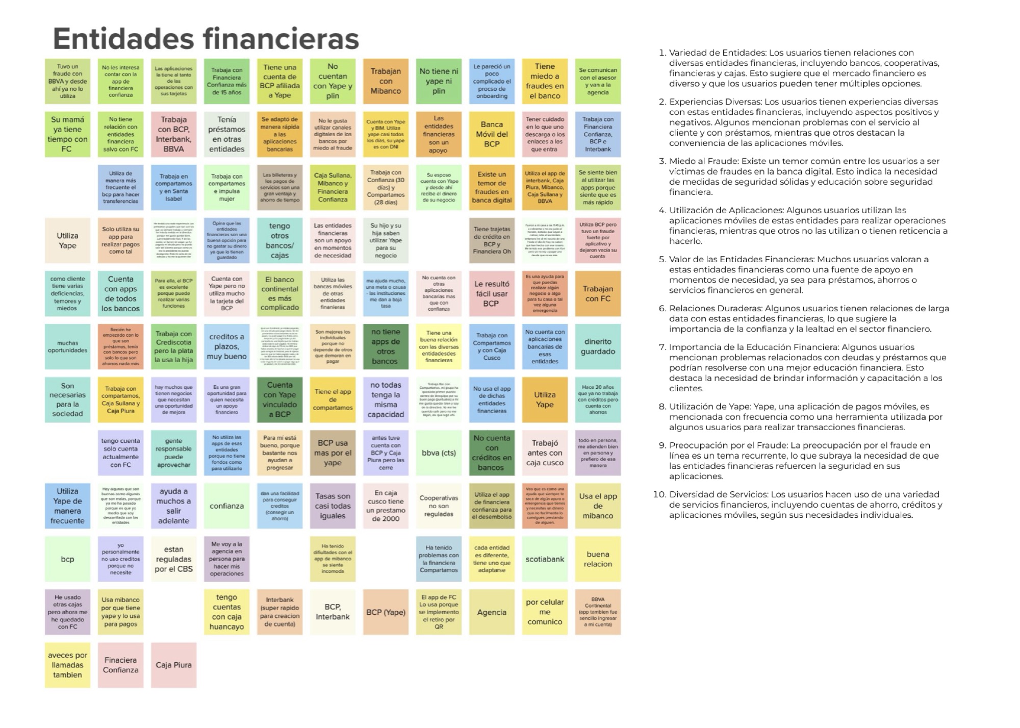
To make sure we heard everyone, I profiled the client base and recruited users from opposite ends of the spectrum: young (18–28) vs. older (45–70), urban vs. rural, heavy users (10+ transactions) vs. people who barely transact (fewer than 3). We combined these interviews with a deep benchmark of the apps our users already knew: BCP, Yape, Plin, Interbank, Mibanco and the regional cajas.
Fear, friction and Yape as the benchmark.
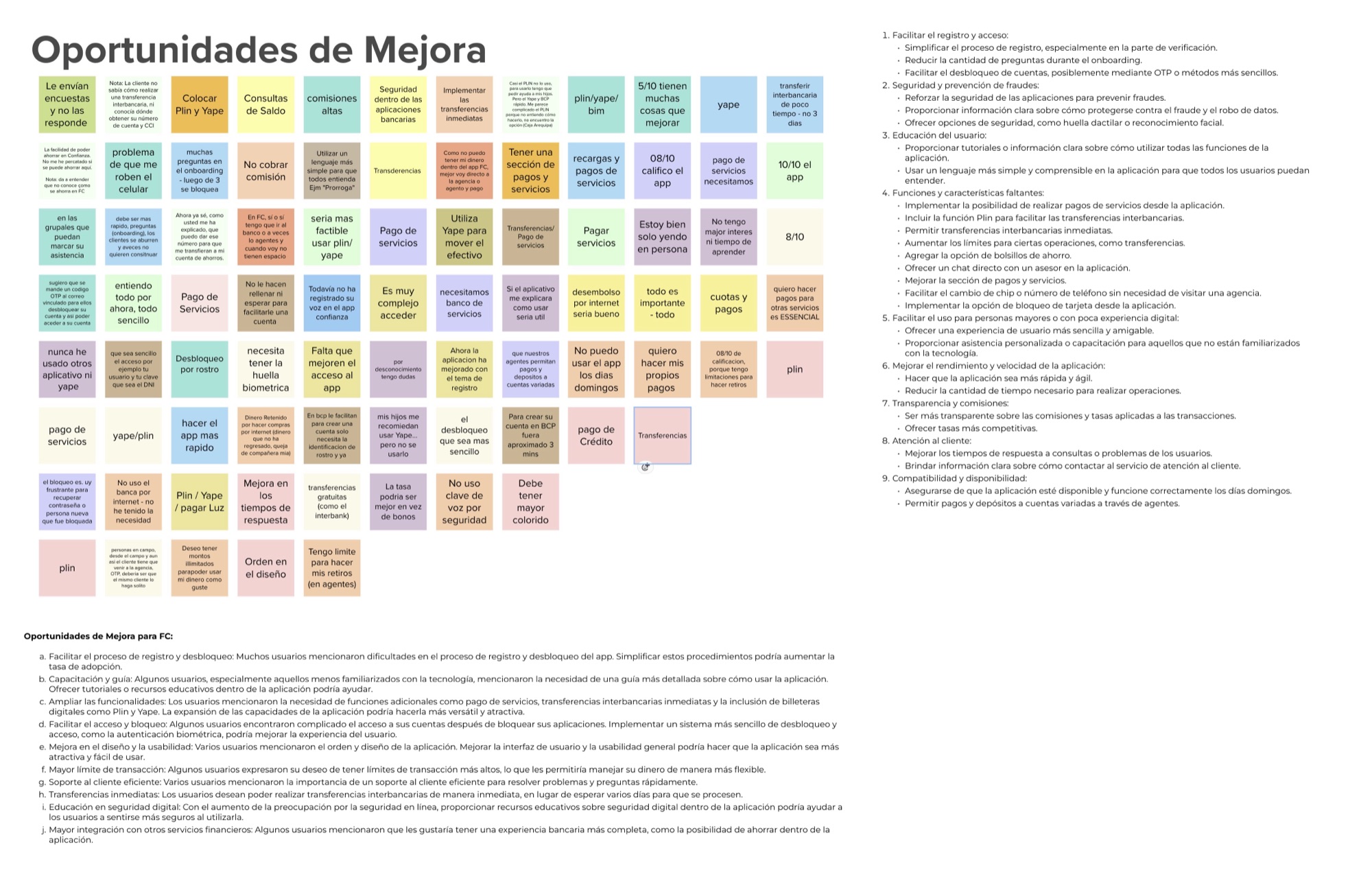
We synthesised every interview into affinity maps. A few themes kept repeating. Signing up and unlocking an account was the biggest wall: too many onboarding questions, and a blocked account often meant a trip to the branch. Fear of fraud was everywhere, and several people had stopped using a bank's app after being scammed.
Yape and Plin had set the bar for what “easy” means. People wanted instant transfers to other banks, Plin built in, bill payments, and plain language they could understand without help. One client told us she used Yape, but only because her children set it up for her.
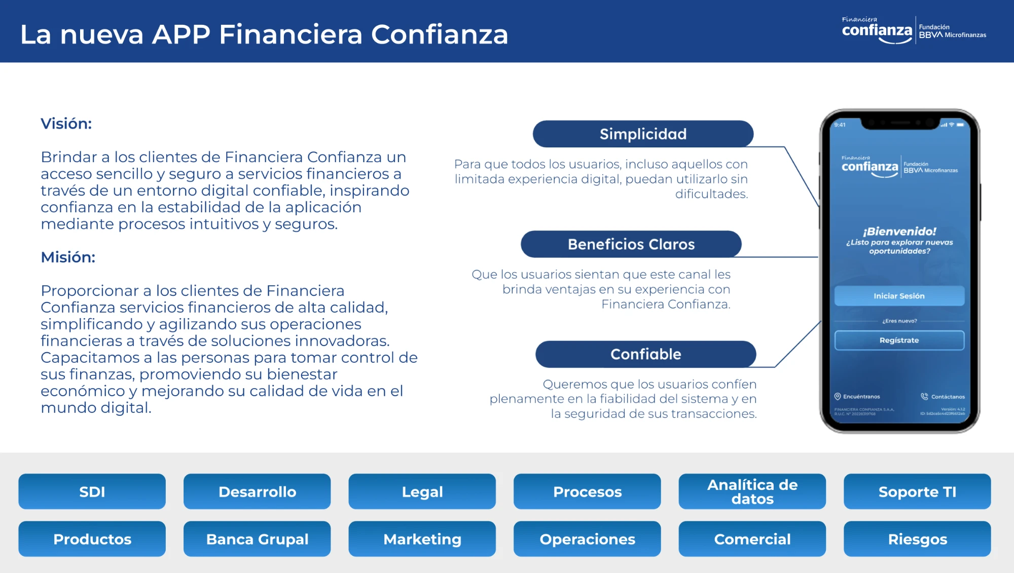
Simple. Clear benefits. Trustworthy.
We turned the research into three principles that every screen had to pass. Simplicity: anyone, including people with little digital experience, can use it without help. Clear benefits: the app should feel like an advantage over going to the branch. Trustworthy: people should feel their money and data are safe.
This was more than a design exercise. It brought together 12 areas of the company, including Development, Legal, Risk, Operations, Data Analytics, Marketing, Commercial and IT Support.
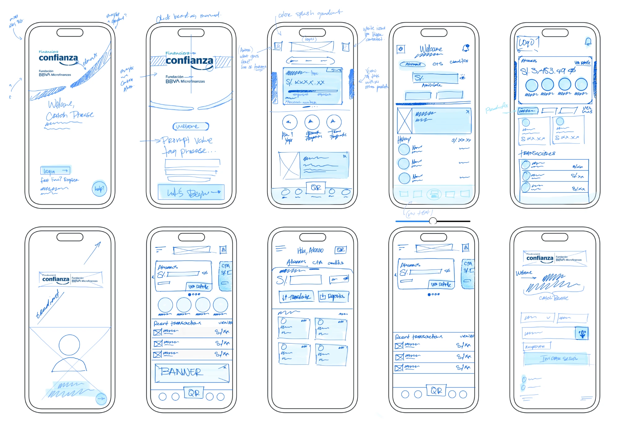
From conversation to clarity.
- Replaced the chat flow with a real home: balance card first, quick actions (Plin, frequent operations, favorite accounts) and a bottom nav with QR in the centre
- Rebuilt login and sign-up around both stakeholder and client needs: fewer steps, biometrics and voice confirmation
- Made privacy visible: hide-balance toggle and the last 3 movements right on the home screen
- Added the features clients asked for in the field: Plin payments, send-to-contact and clearer error messages
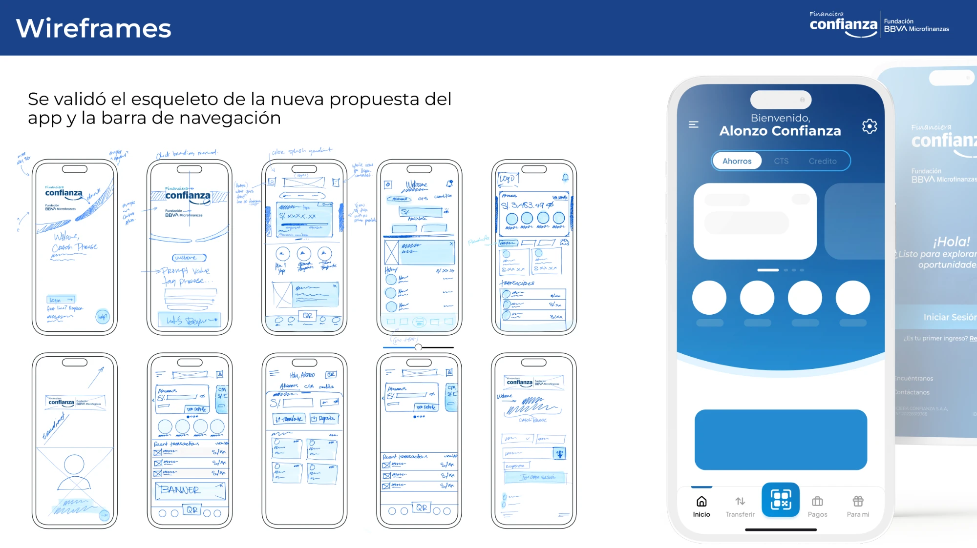
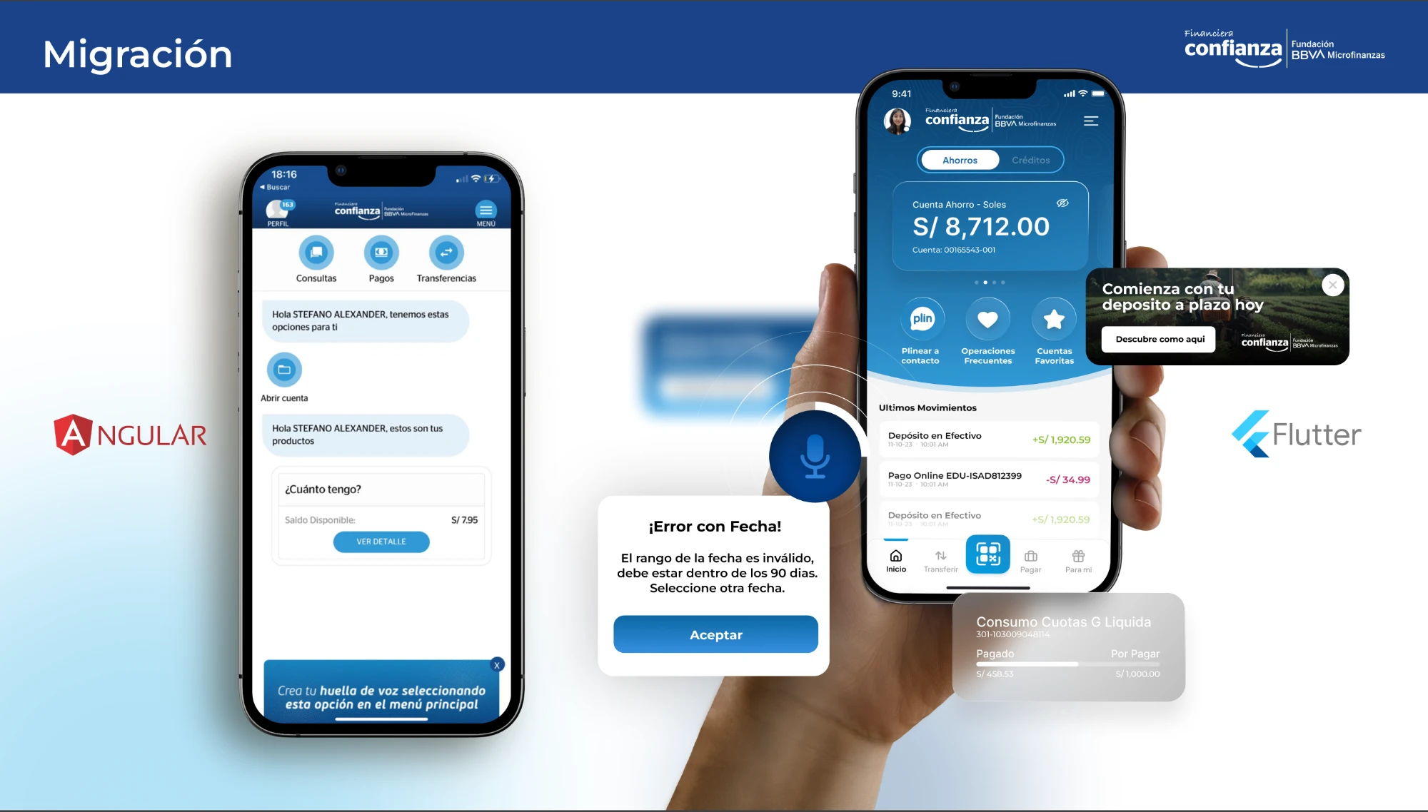
Angular to Flutter, one sprint at a time.
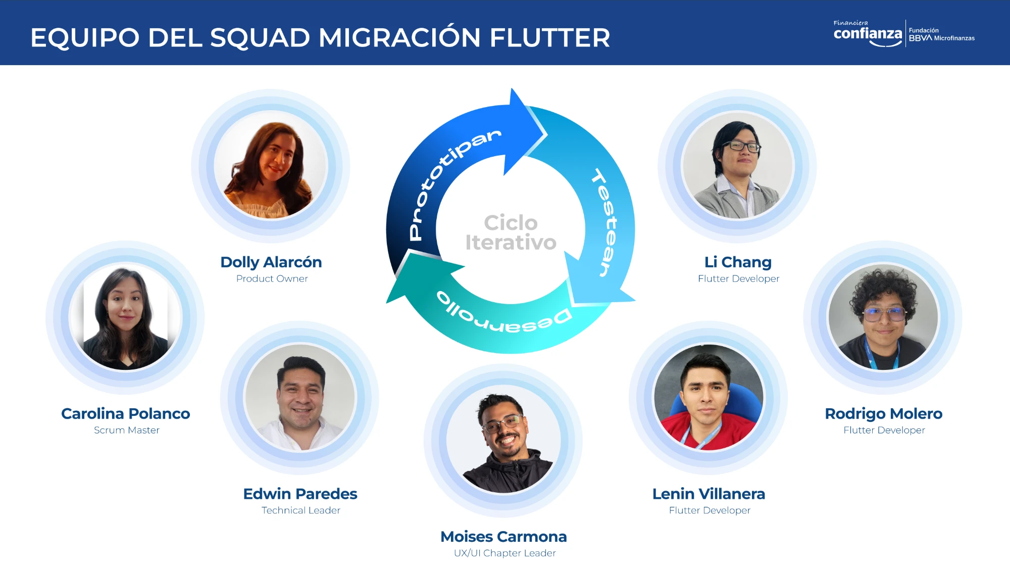
We rebuilt the app from Angular into Flutter (Dart) with a small cross-functional squad: a product owner, scrum master, tech lead, three Flutter developers and me as UX/UI Chapter Leader. We worked in a continuous loop of prototyping, testing and development, putting designs in front of real users before every release.
An app people actually use.
The new Financiera Confianza App is live on iOS and Android, with an estimated usability rate of around 70%, up from 6.3% with the legacy app. Advisors and administrators can now confidently recommend it, and clients can do things that used to need a branch visit: pay with Plin, send money to contacts, check movements and confirm operations with their voice.
We're not done. We keep testing and refining the interface, but it is now a product built around the people who use it.