Fábrica de Créditos
End-to-end UX for Crédito 20 Minutos, the in-store credit line behind Alkosto and Ktronix. Research, flows, a design system and a tested functional prototype.

A credit answer in 20 minutes needs a factory behind it.
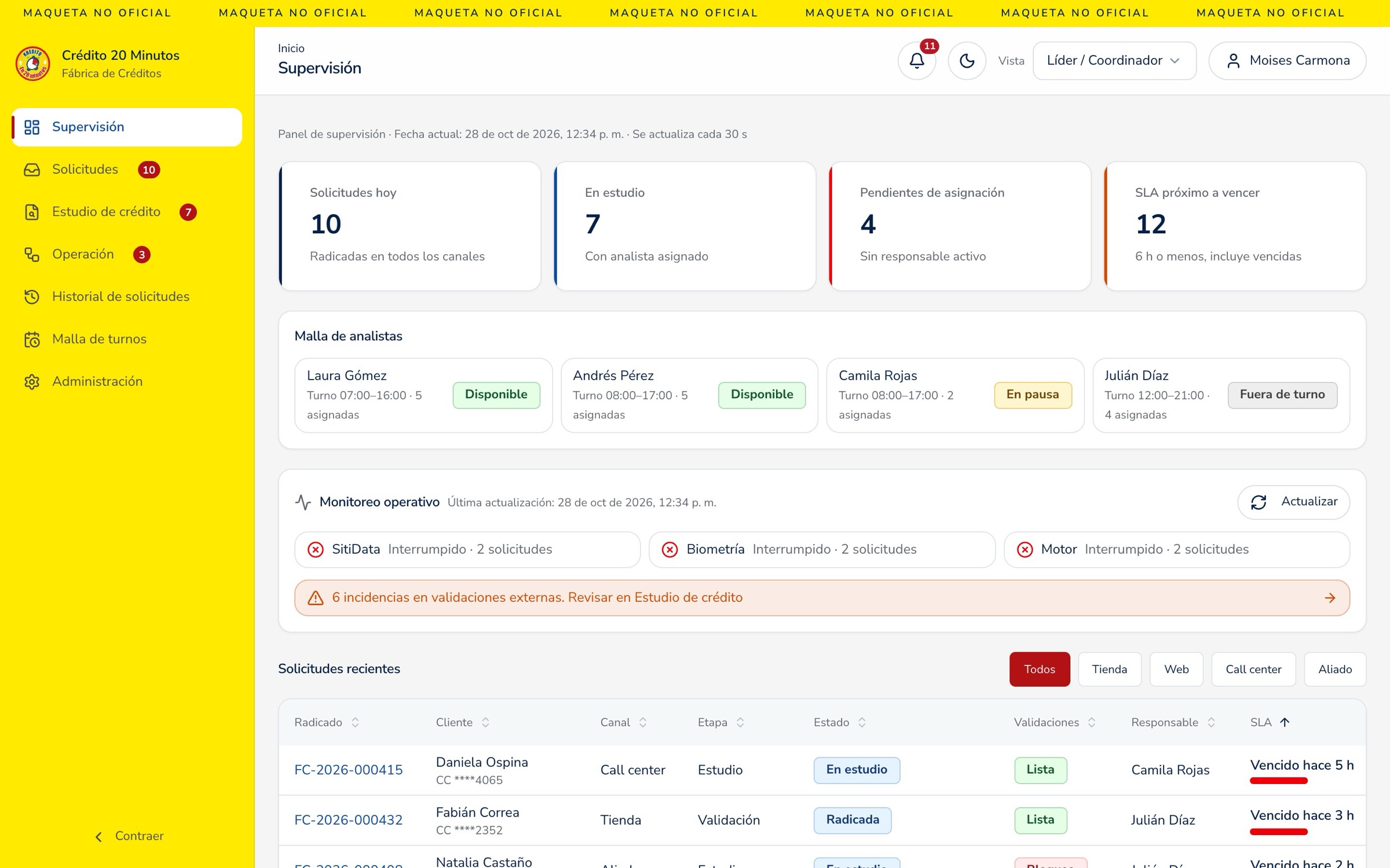
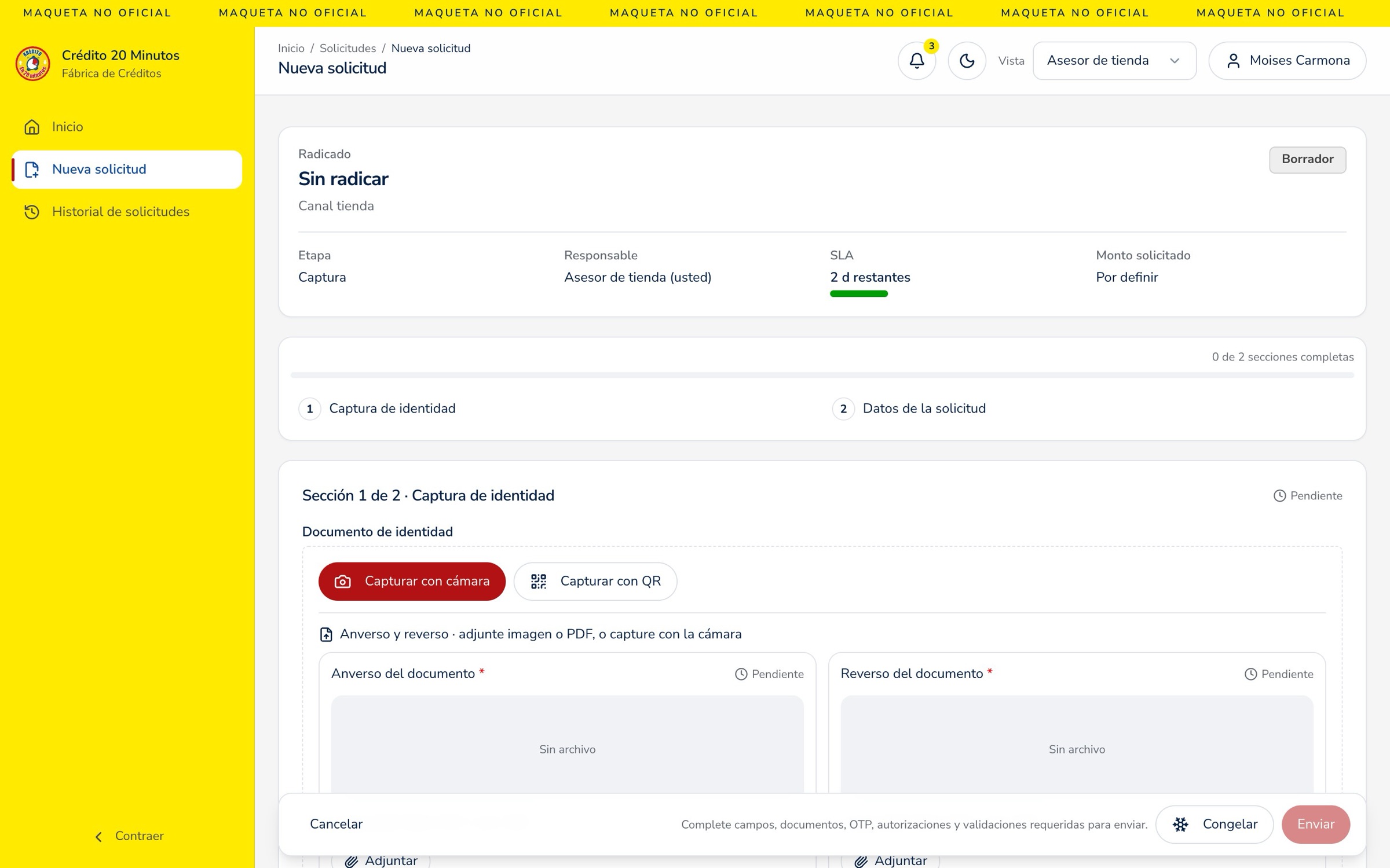
Crédito 20 Minutos lets Alkosto and Ktronix shoppers get financing at the counter. Behind it is an internal tool, the credit factory, used by four roles: store advisors who start the application, analysts who study it, leaders who balance the queue and admins who set the rules.
I owned the UX end to end, from benchmark and research to flows, design system and a functional prototype the client tested before any API was connected.
People trust the advisor more than their phone.
Clients had to repeat their data, never saw the total cost, and when something failed nobody told them why or what came next. Advisors and analysts worked with fragmented information under time pressure. The result was abandoned applications, rejections that felt unfair and a rising risk of identity fraud.
Speed is table stakes. Clarity is the edge.
The benchmark (Nu, Bancolombia, Davivienda, Rappi, Addi and others) showed that “approved in minutes” is already the market standard. So I reframed the goal: be the best assisted credit, with one shared file from store to analyst, verified identity, an OTP signature on the client's phone, and an answer that's explained even when it's “not for now”.
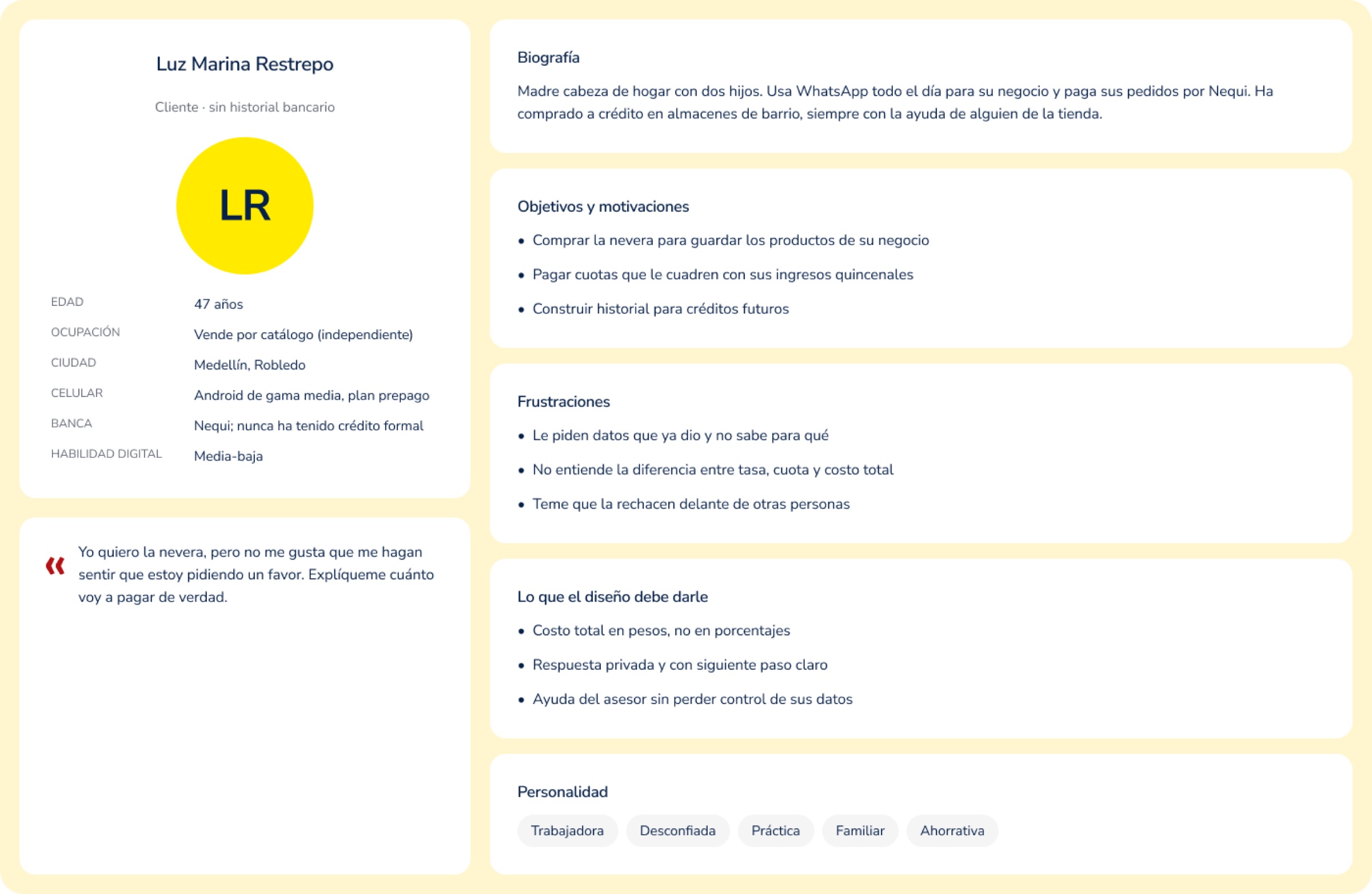
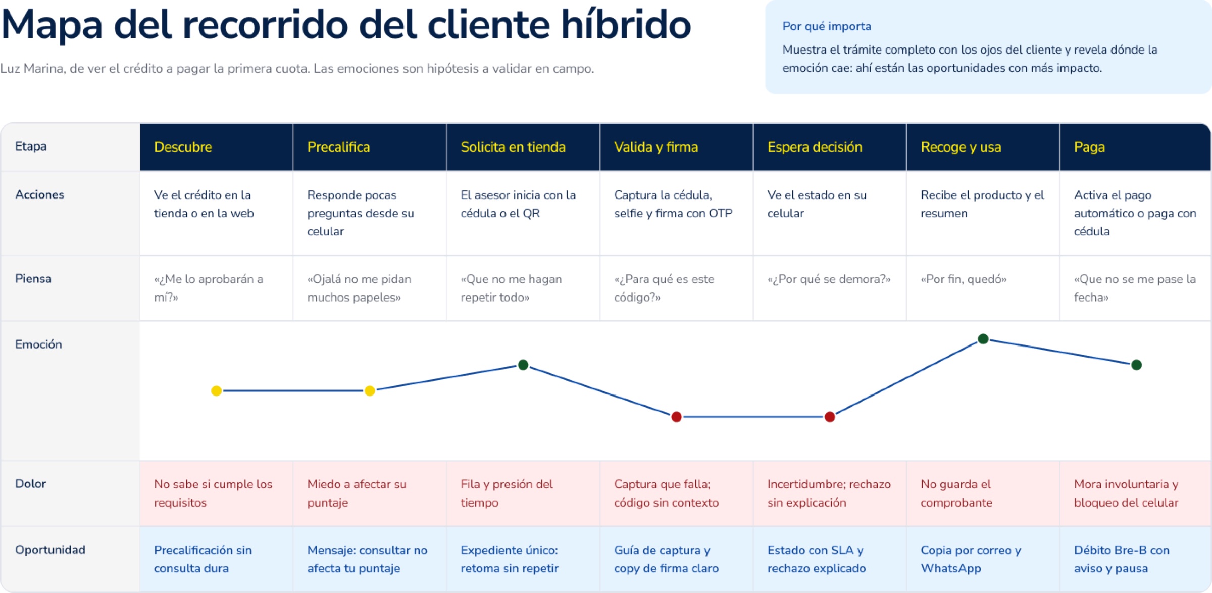
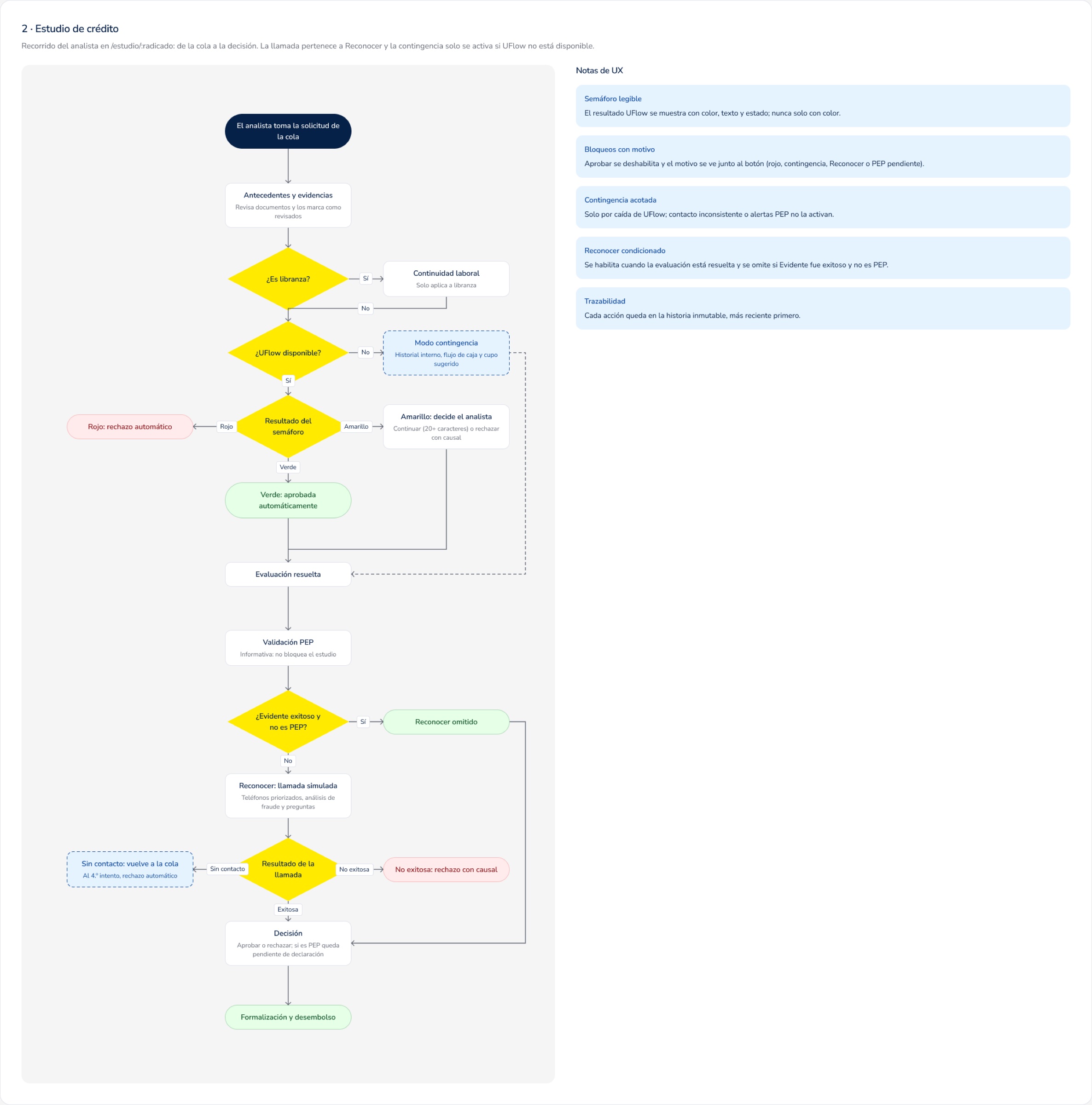
What I designed, and why.
- One file, four roles: a single application ID shared by the store, the study and operations, so nobody re-enters data
- Automated checks first: credit bureau, identity, risk engine and PEP screening lead the analyst's view, so attention goes where a human is needed
- A readable risk traffic light: green approves, red rejects with a visible reason, yellow goes to the analyst
- Unhappy paths designed on purpose: an explicit contingency mode if the risk engine is down, and failed calls return to the queue instead of getting lost
- SLA as a countdown on every case, because in a 20-minute promise time is the product
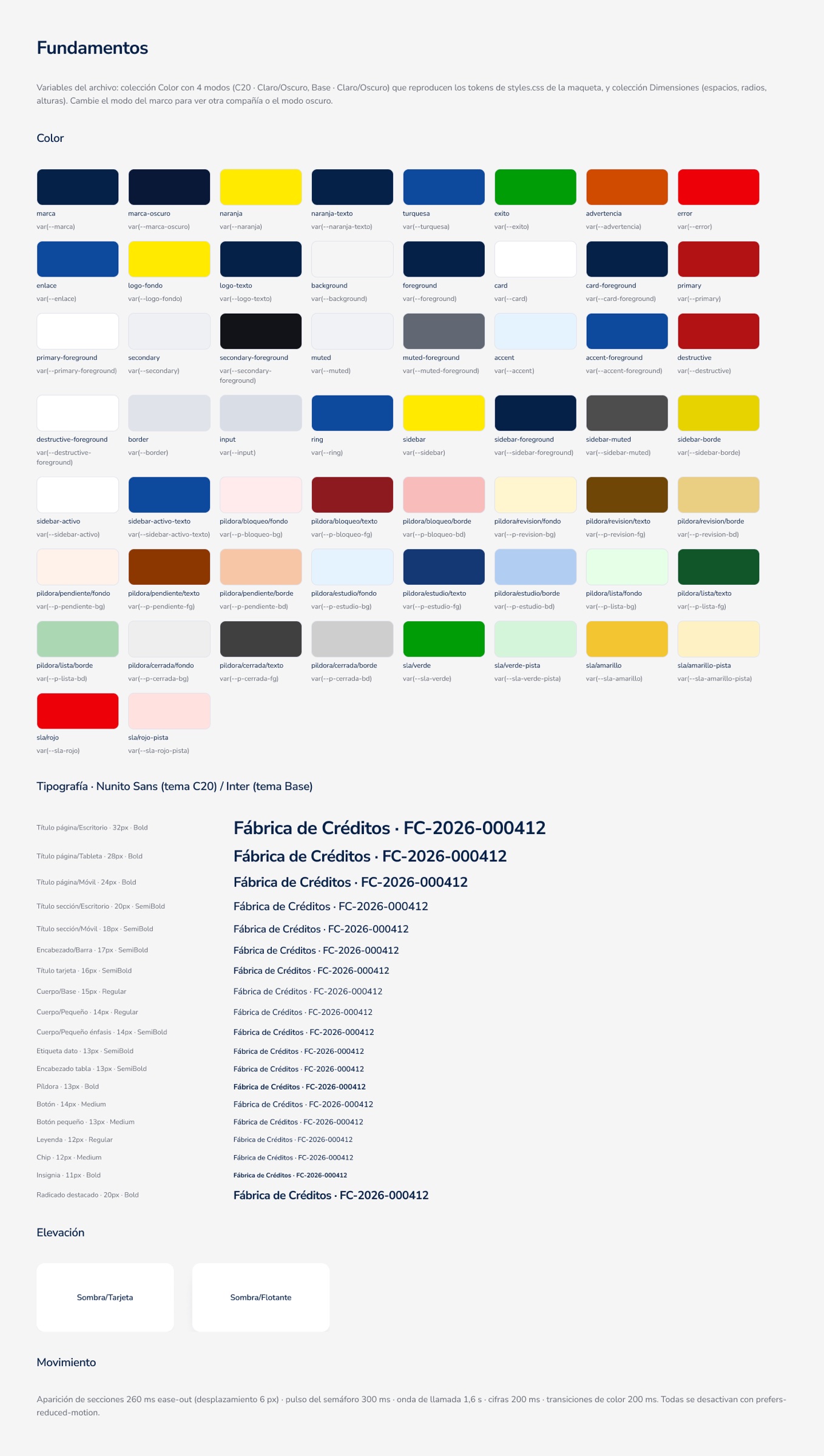
Foundations, components and principles, documented in Figma.
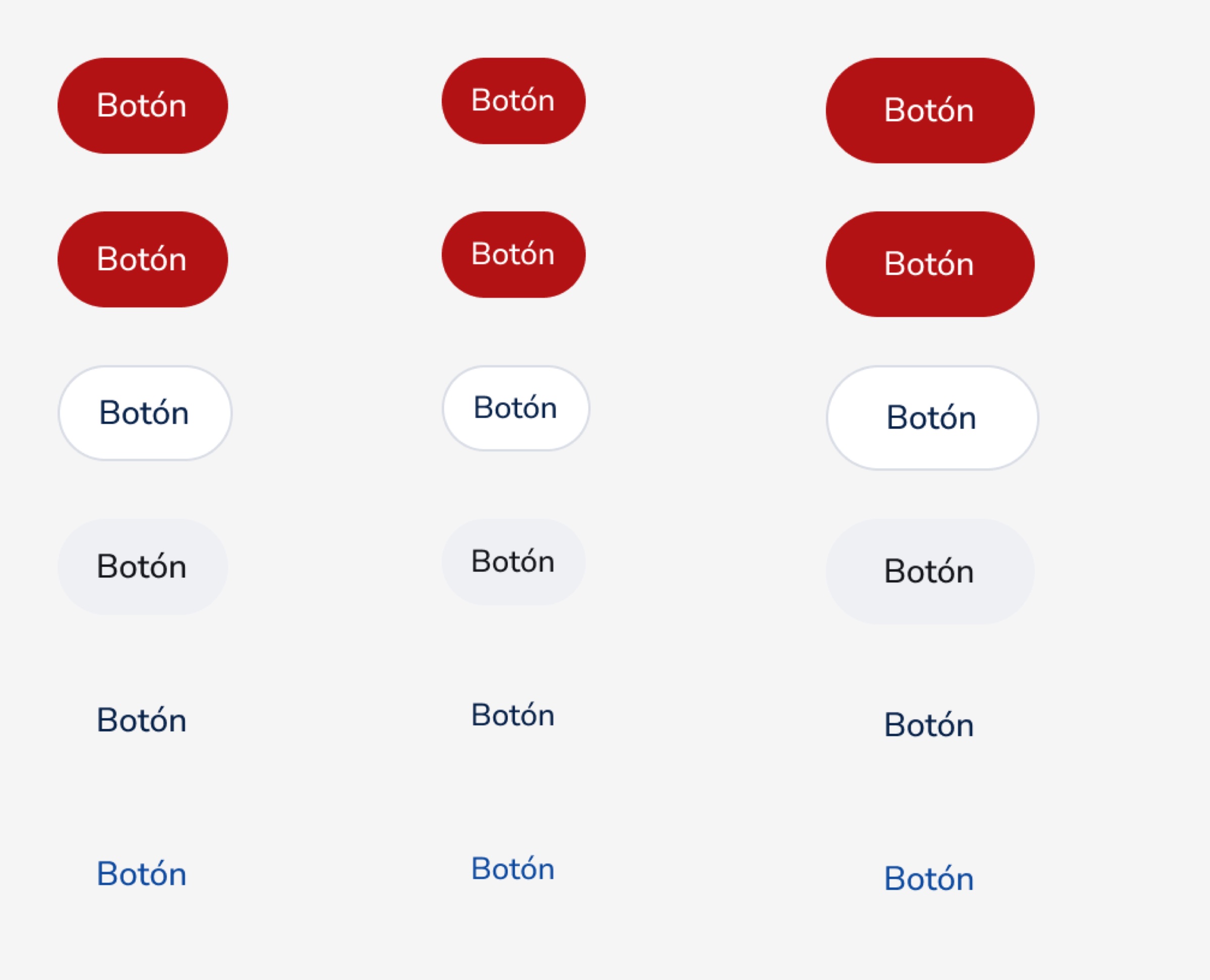
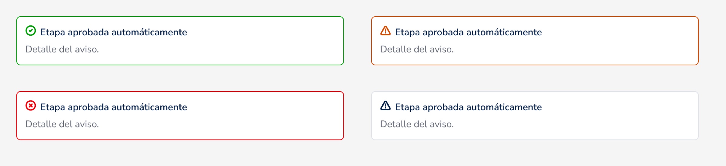
Semantic color tokens with WCAG-checked contrast, a responsive type scale, and a component library with every state: buttons, fields, status pills, SLA chips, alerts, the risk traffic light, validation rows, KPI cards, role-based sidebars and a 30-icon set. All of it sits on 10 UX principles and a microcopy guide.



Tested by the client before development.
I built the Figma designs into a functional prototype in Lovable with Claude. Every screen showed its use-case ID and a scope status, so client feedback mapped straight back to the 322 use cases: 140 approved, 161 refined and 21 excluded.
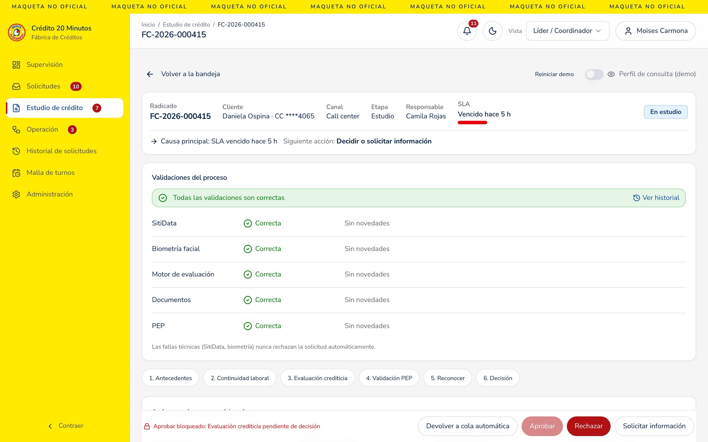
Decisions settled before a single API call.
Corbeta validated research, flows and a working product instead of static screens. Development received a documented design system and flows already tested with the people who will use them, so engineering started from decisions that were already validated.