iCook
Five years with a culinary startup, from a Brazilian cooking community app to a San Francisco platform that brings Michelin-level chefs into private homes.
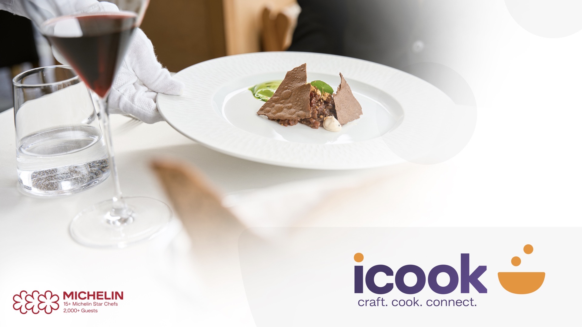
Putting the Michelin experience on your smartphone.
iCook started in Brazil as a culinary community app. From 2021 to 2024 I grew from Senior Graphic & Web Designer to Lead UI/UX, owning the app, the brand system, the website and social.
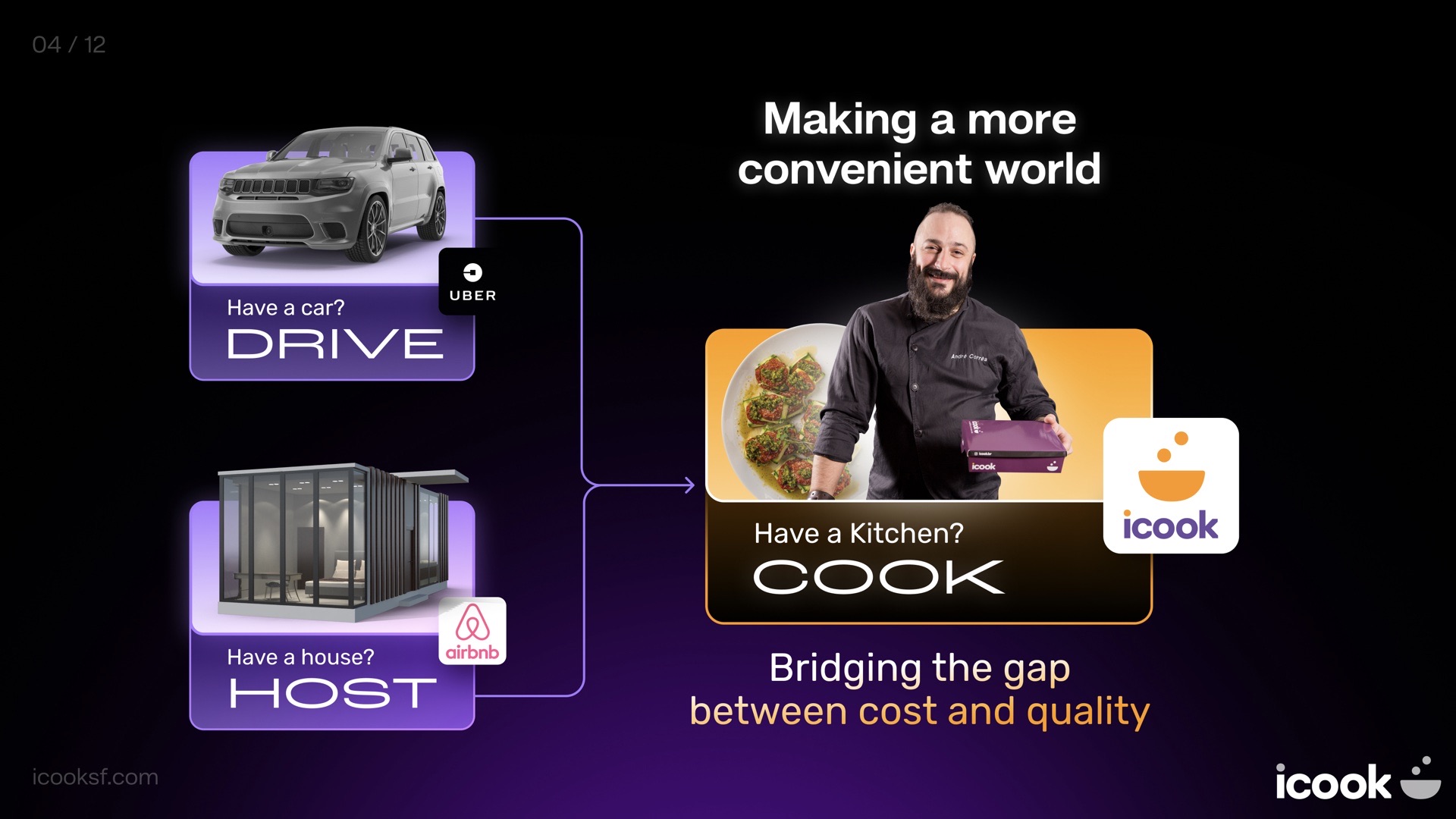
Today I work with iCook as a contract designer in San Francisco, where the product has evolved into a platform that connects Michelin-trained chefs with private hosts. Think OpenTable, catering and Uber in one app.
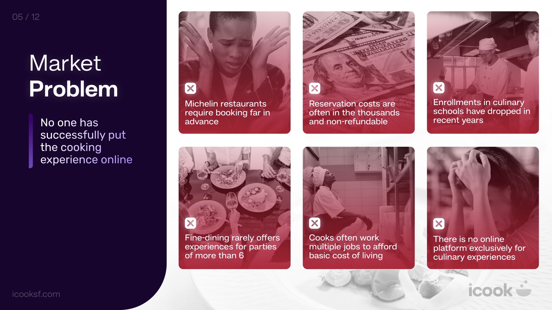
Fine dining is out of reach, and so is a fair wage for the people who cook it.
For guests, Michelin restaurants mean booking far in advance, costly non-refundable reservations, and rarely anything for groups bigger than six. For cooks, it means 14-hour days, capped wages and no creative autonomy, hidden behind the line. No platform was built just for culinary experiences.
What I designed, and why.
- Positioning the chef as the hero: a certified-chef profile and badge, so guests book a person, not a menu
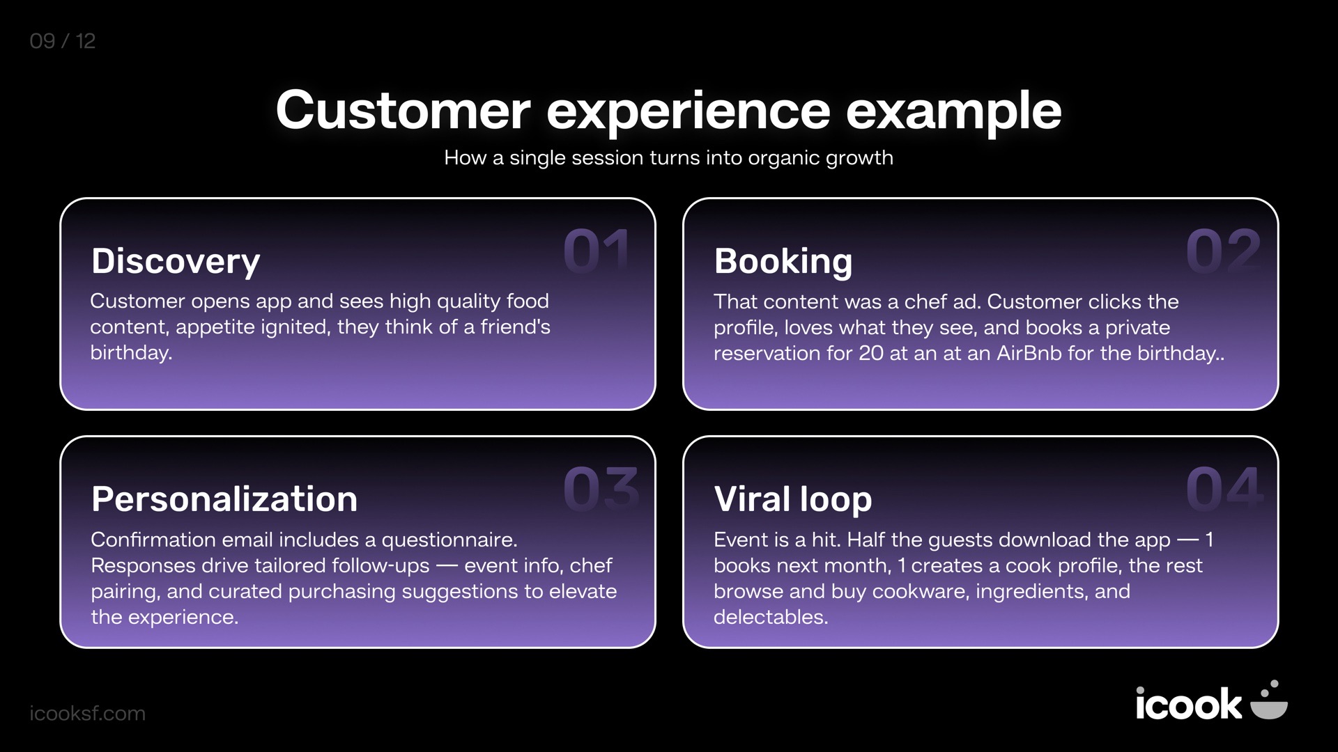
- A booking flow built on discovery: food content leads to a chef profile, then to a reservation for any group size
- Personalization after booking: a short questionnaire shapes the menu, wine pairing and follow-ups
- A viral loop by design: guests at an event become the next app downloads and bookings
- A two-sided story: a dedicated recruiting site for chefs (“Your vision. Your menu.”) alongside the guest app
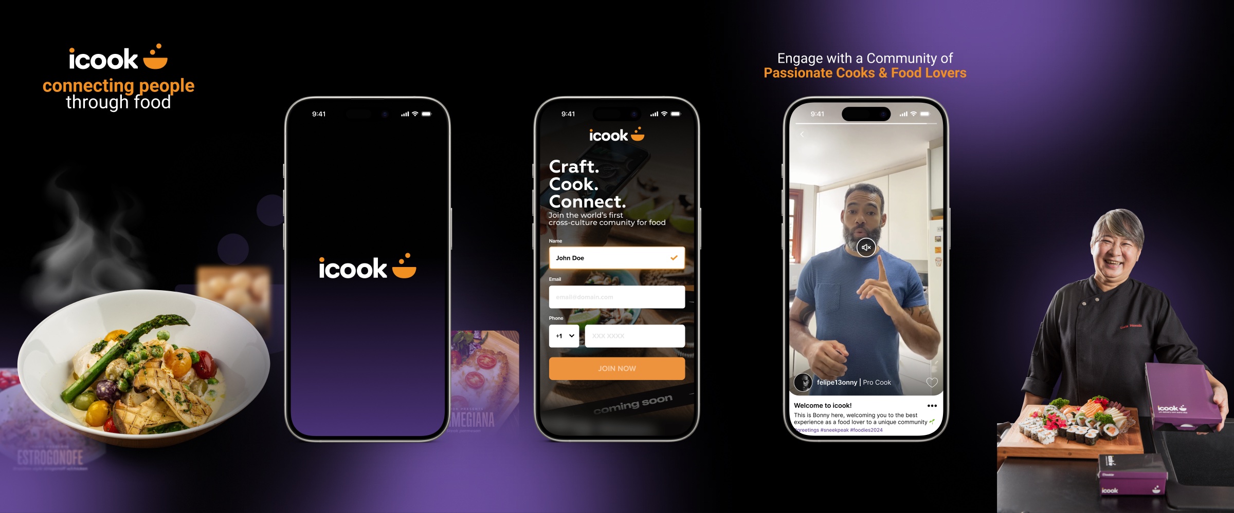
Warm. Playful. Effortless.
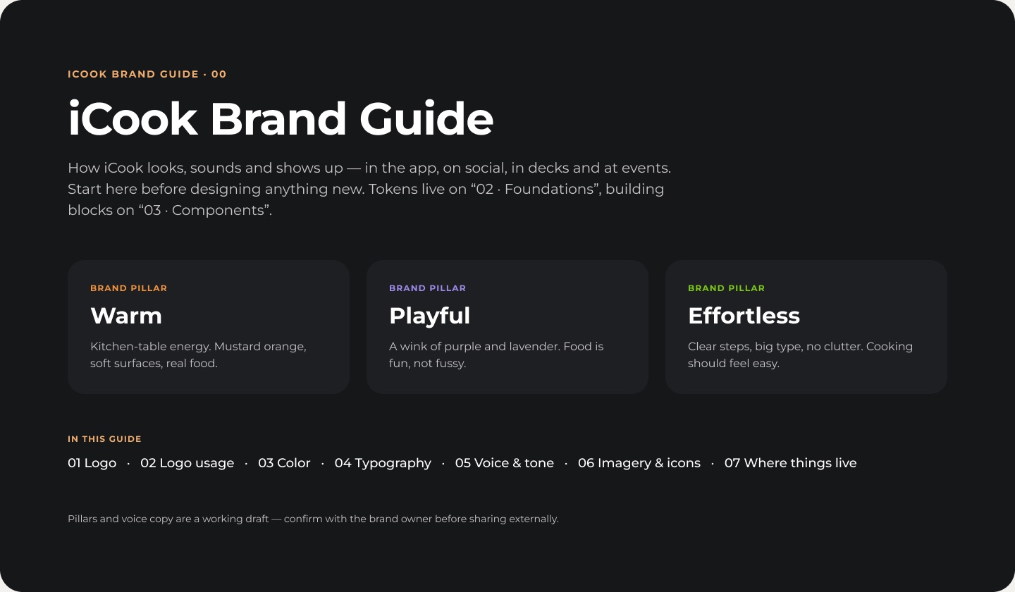
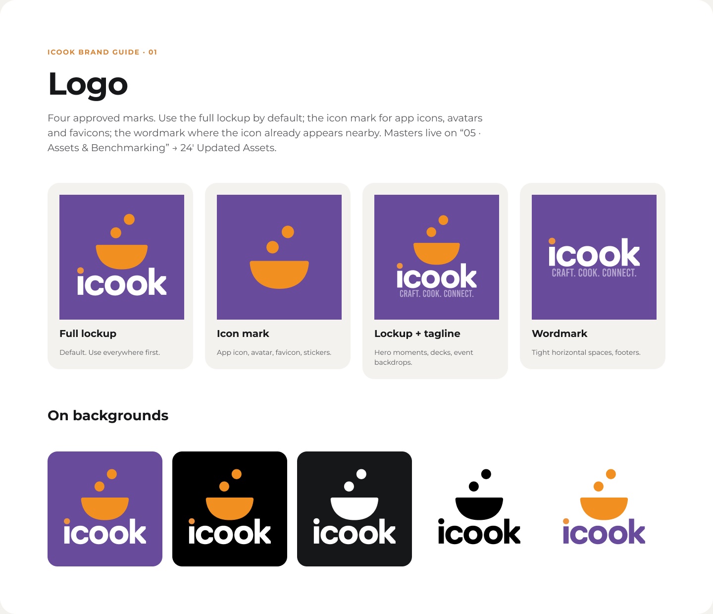
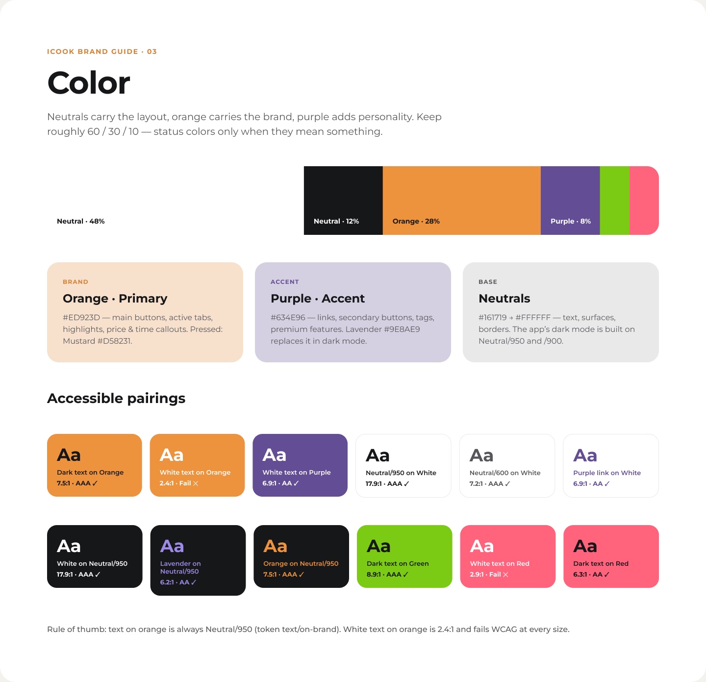
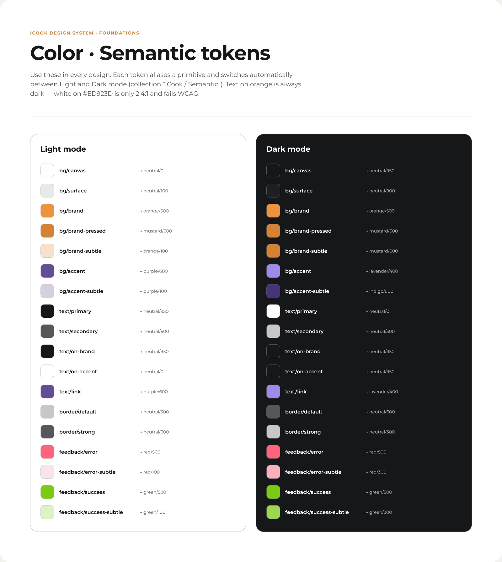
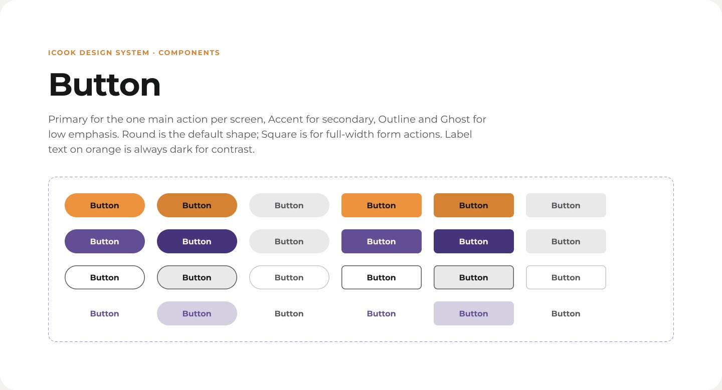
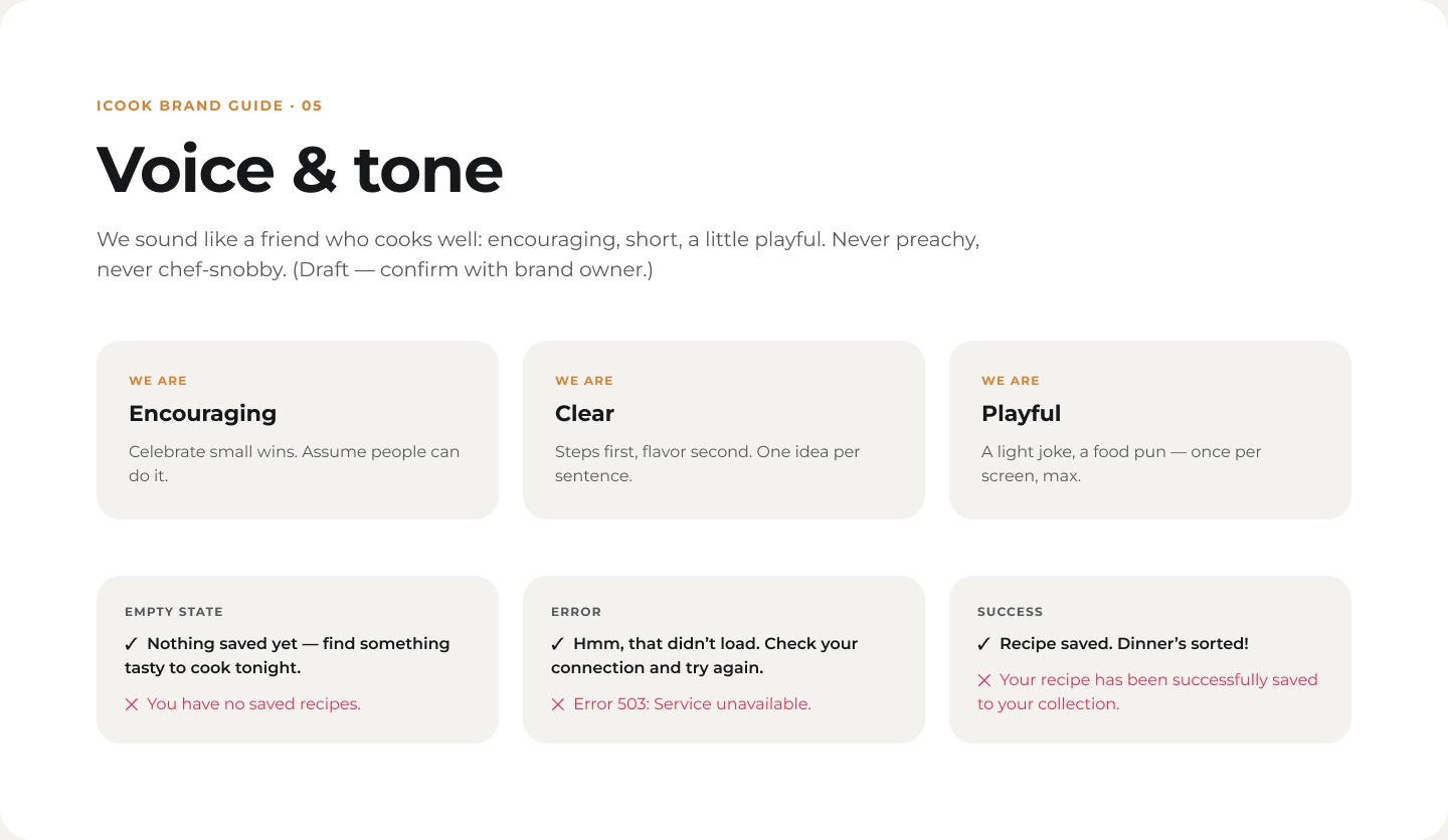
For the 2026 relaunch I rebuilt the brand and UI as one Figma design system: a brand guide (pillars, four logo marks with usage rules, color proportions, typography, and voice and tone with real examples), foundations with primitives, 18 semantic tokens that switch between light and dark mode, gradients, type, elevation, and a 4-pt spacing and radius scale.
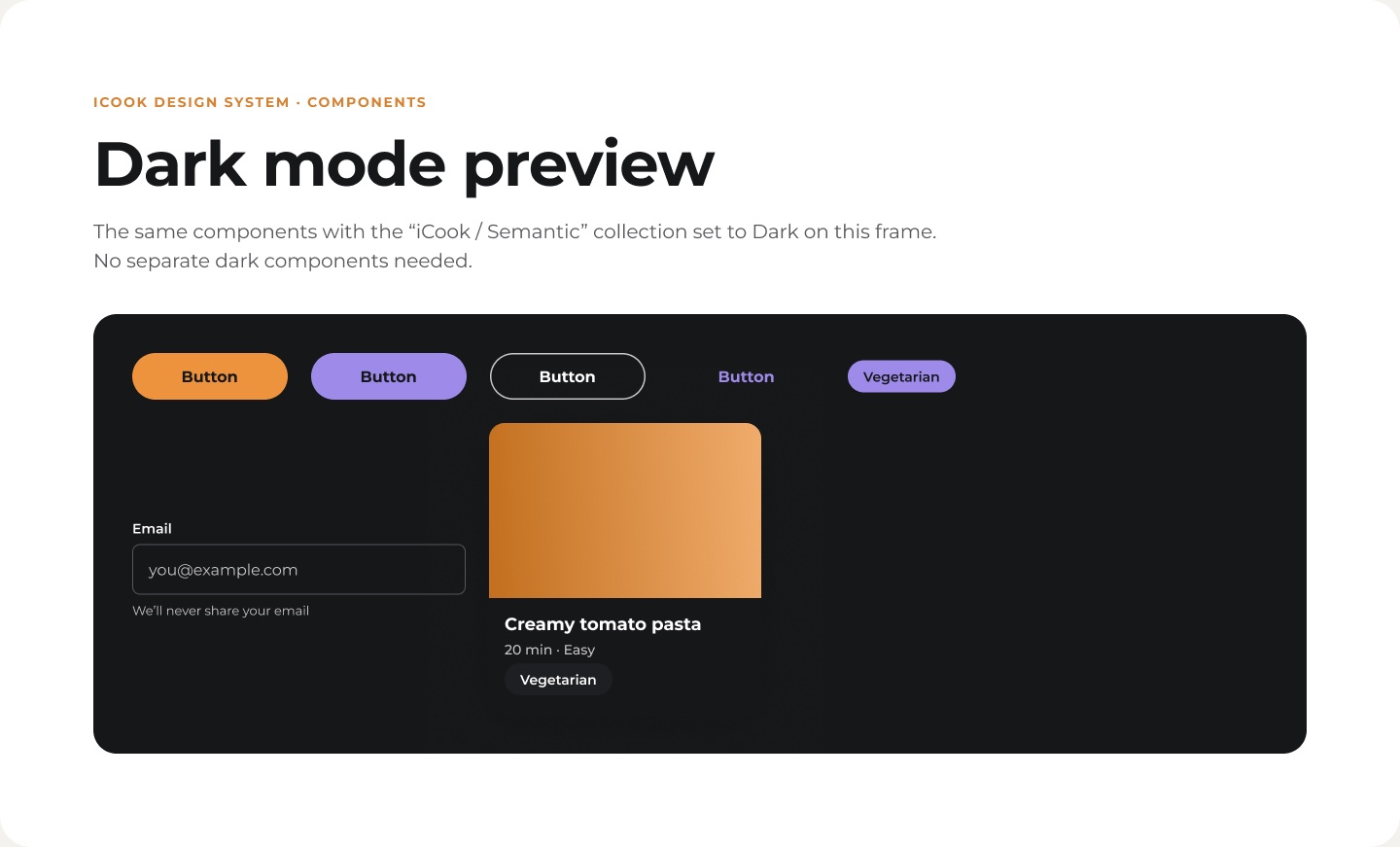
One accessibility rule shaped the whole UI: white text on iCook orange is only 2.4:1, so text on orange is always dark. Components (buttons, chips, text fields, recipe cards) are built on the tokens, so dark mode works with no separate components.
A logo that cooks.
Logo animation explorations for app launch, social and event screens. The bowl and the drops come together like a dish being plated.
From product to pitch.
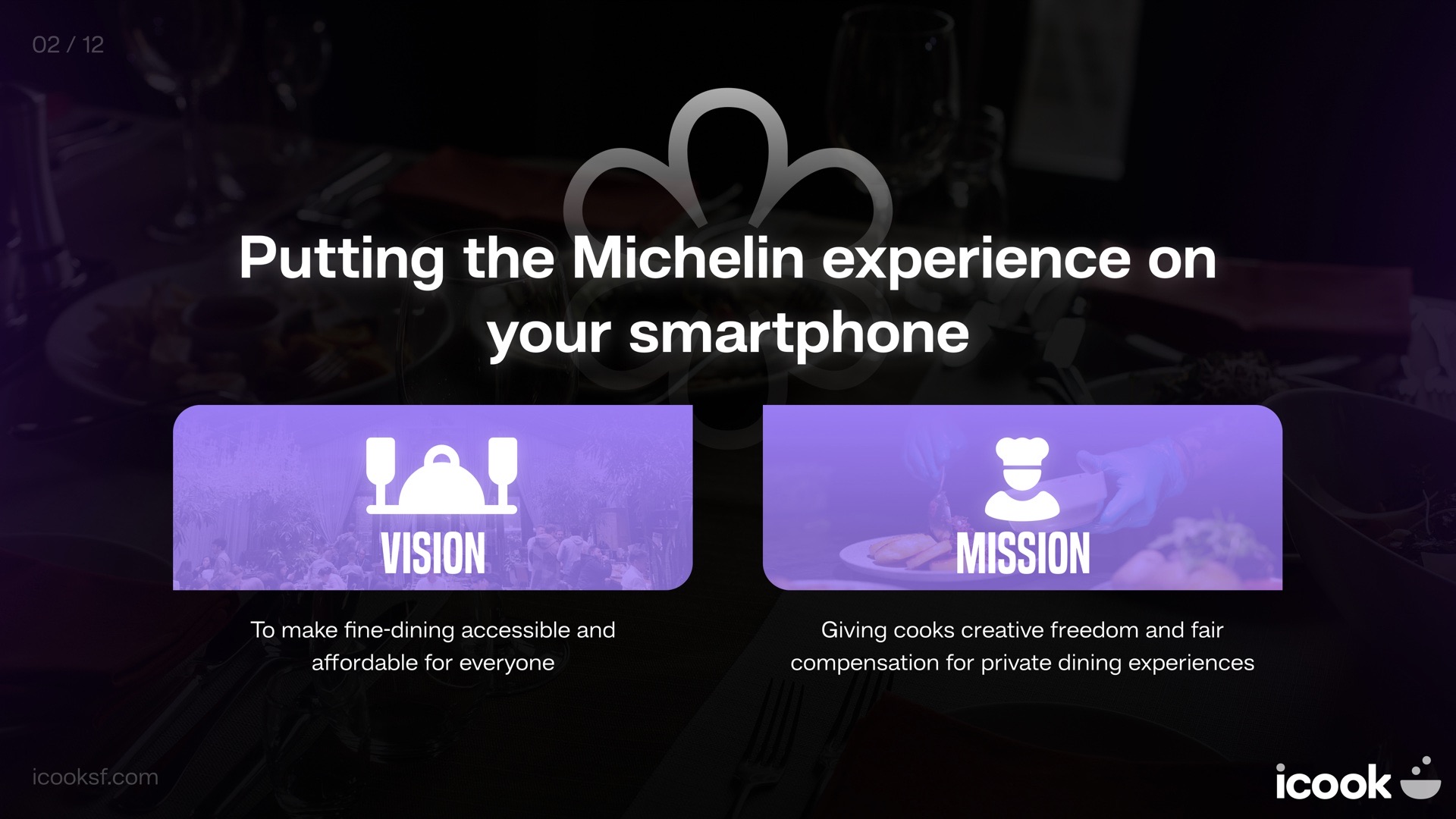
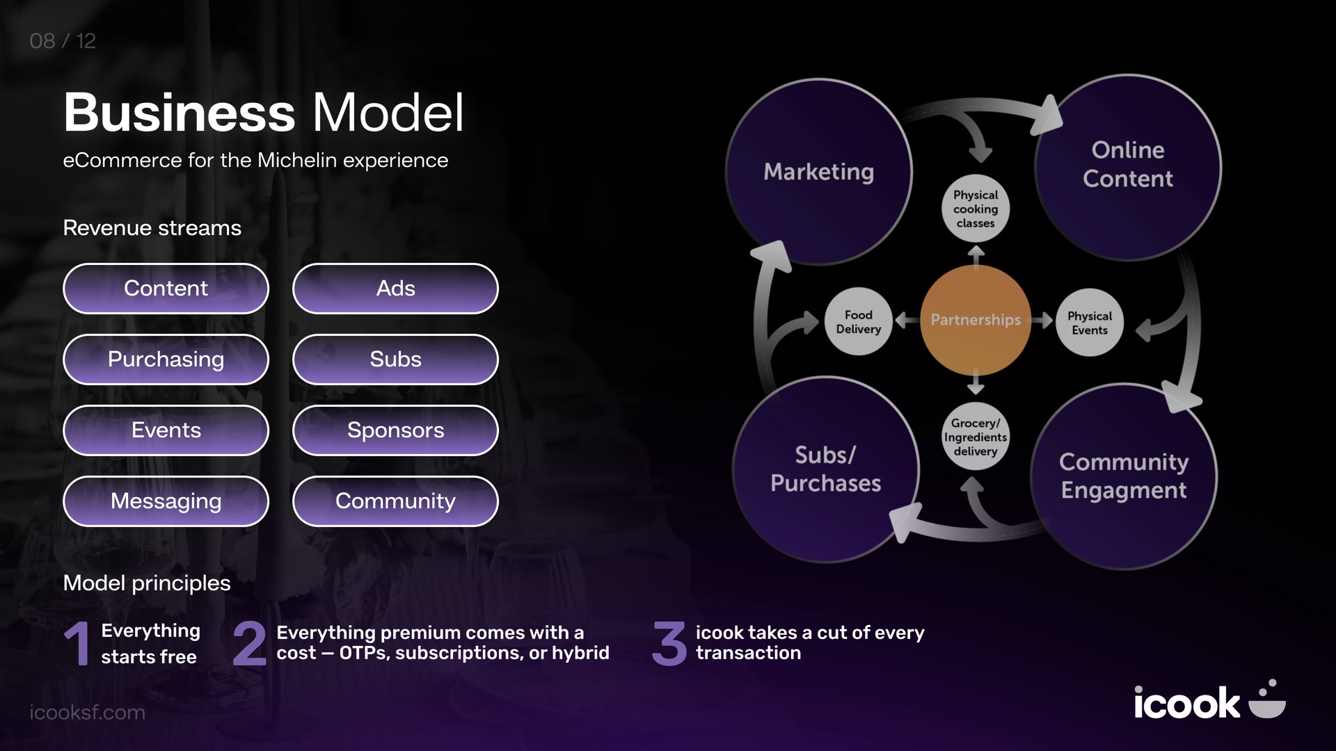
I also design how iCook presents itself: investor and partner decks, event materials and the chef-recruiting site. The deck frames the vision (make fine dining accessible), the mission (creative freedom and fair pay for cooks) and a business model where everything starts free and iCook takes a share of each transaction.
One brand, from a community app to Michelin tables.
iCook now has a single source of truth for brand and UI. Product, marketing, decks and events all draw from the same tokens and rules, ready for the San Francisco launch and the founding-chef program.